Lecture 4: Visualizing data
CME/STATS 195
Lan Huong Nguyen
October 9, 2018
Contents
- Intro to
ggplot2package - Comparison with base-graphics
- Aesthetic mappings
- Geometric objects
- Statistical transformations
- Facets
- Scales

The ggplot package
The ggplot package is a part of the core of tidyverse.
ggplot2is a plotting system for R, based on the grammar of graphics. It takes care of many of the fiddly details that make plotting a hassle (like drawing legends) as well as providing a powerful model of graphics that makes it easy to produce complex multi-layered graphics 1.
It is the most elegant and versatile tool for graphically visualizing data in R, offering a coherent system (or grammar) for building graphs.
R base graphics
plot(unemp_rate ~ date, data = economics, type = "l")
ggplot2 package
library(tidyverse)
ggplot(data = economics, aes(x = date, y = unemp_rate)) + geom_line()
ggplot() by itself does not plot the data
ggplot(data = economics, aes(x = date, y = unemp_rate))
You need to add a line-layer
ggplot(data = economics, aes(x = date, y = unemp_rate)) + geom_line()
Change the background color to white
ggplot(data = economics, aes(x = date, y = unemp_rate)) +
  geom_line() + theme_bw()
Using base graphics
data09 <- subset(economics, year == "2009")
data14 <- subset(economics, year == "2014")
plot(unemp_rate ~ month, data = data09, ylim = c(0.02, 0.05), type = "l")
lines(unemp_rate ~ month, data = data14, col = "red")
legend("topleft", c("2009", "2014"), col = c("black", "red"), lty = c(1,1))
Using ggplot2
There is no need of specifing a legend:
ggplot(data = economics %>% filter(year %in% c(2014, 2009)),
       aes(x = month, y = unemp_rate)) +
geom_line(aes(group = year, color = year)) 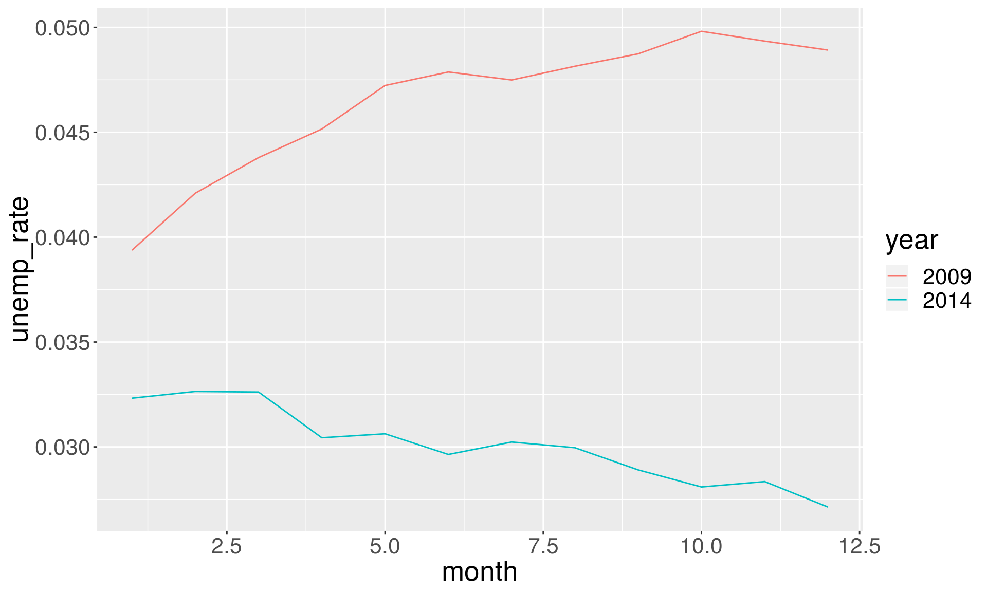
Plotting all the years together is easy
ggplot(data = economics, aes(x = month, y = unemp_rate)) +
  geom_line(aes(color = year)) +
  theme(axis.text.x = element_text(angle = 45))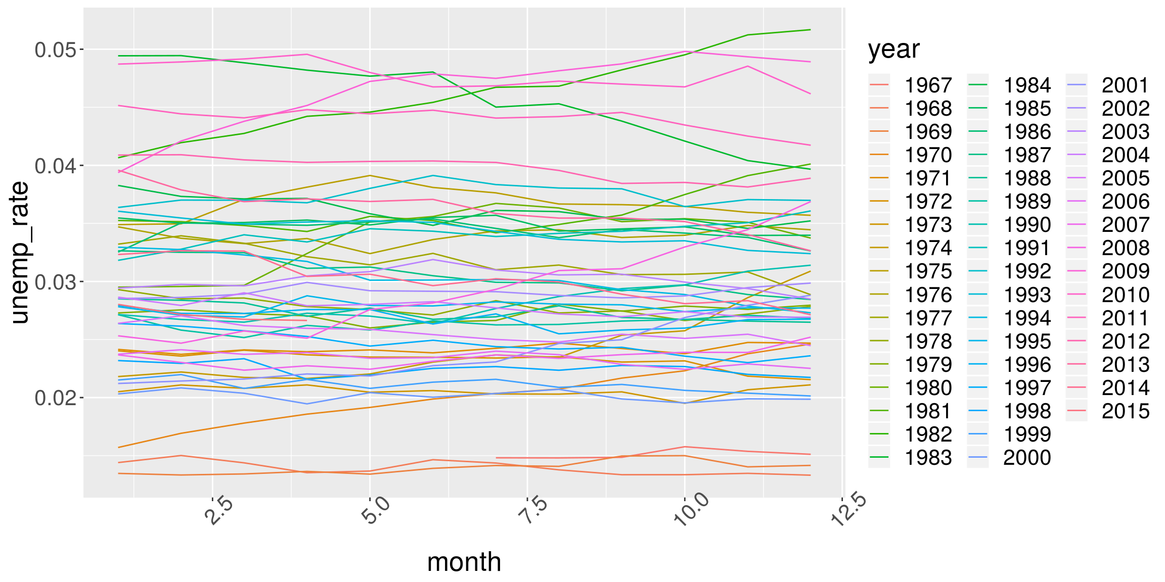
Plotting all the years together is easy
ggplot(data = economics, aes(x = month, y = unemp_rate)) +
  geom_line(aes(group = year, color = pop)) +
  theme(axis.text.x = element_text(angle = 45))
Scatter plots
# Note that we can save `ggplot` as an object
p <- ggplot(diamonds, aes(x = carat, y = price))
p + geom_point()
Text labels plots
plog <- ggplot(
  sample_n(diamonds, 100),
  aes(x = log10(carat), y = log10(price)))
plog + geom_text(aes(label = clarity))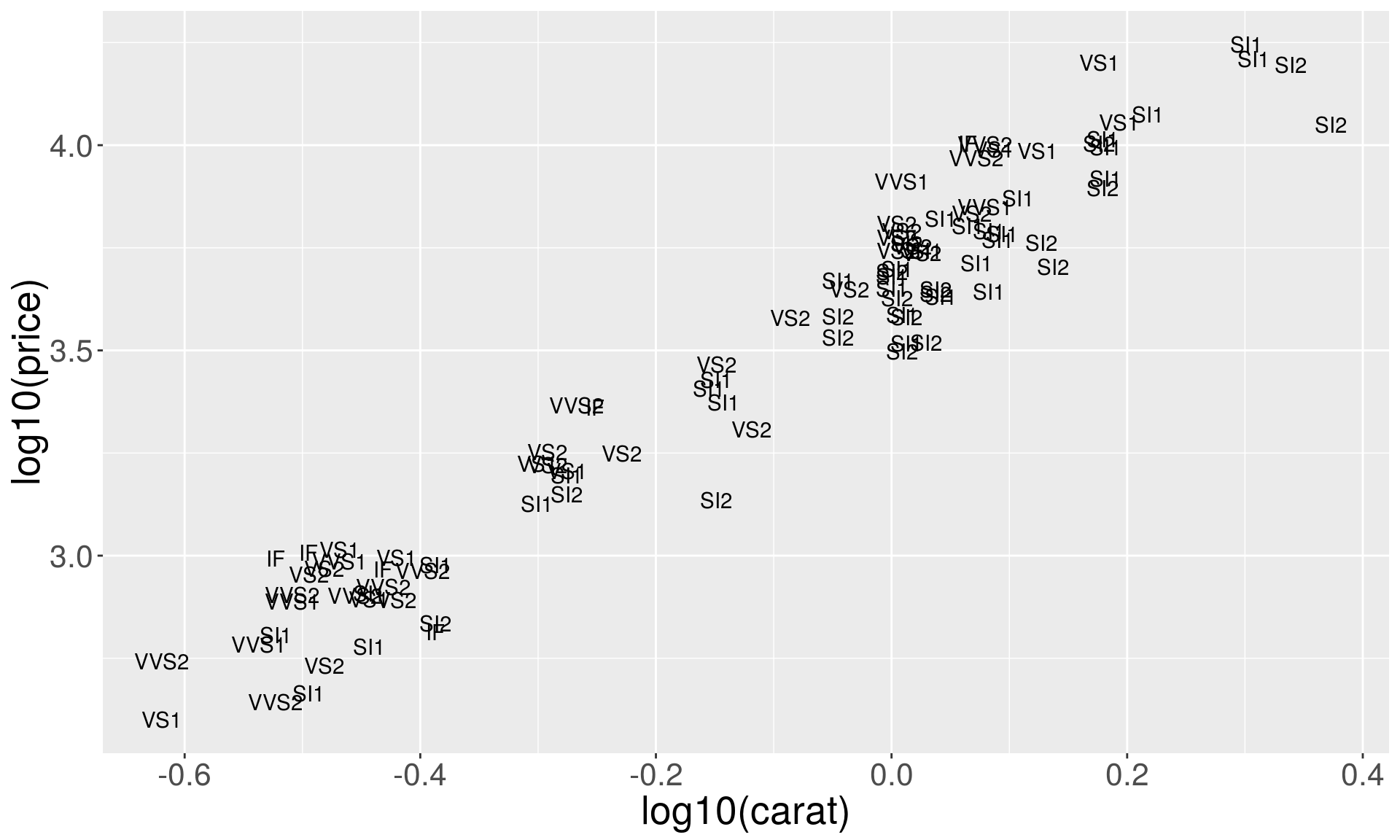
Text plots with rectangle plates
plog + geom_label(aes(label = clarity))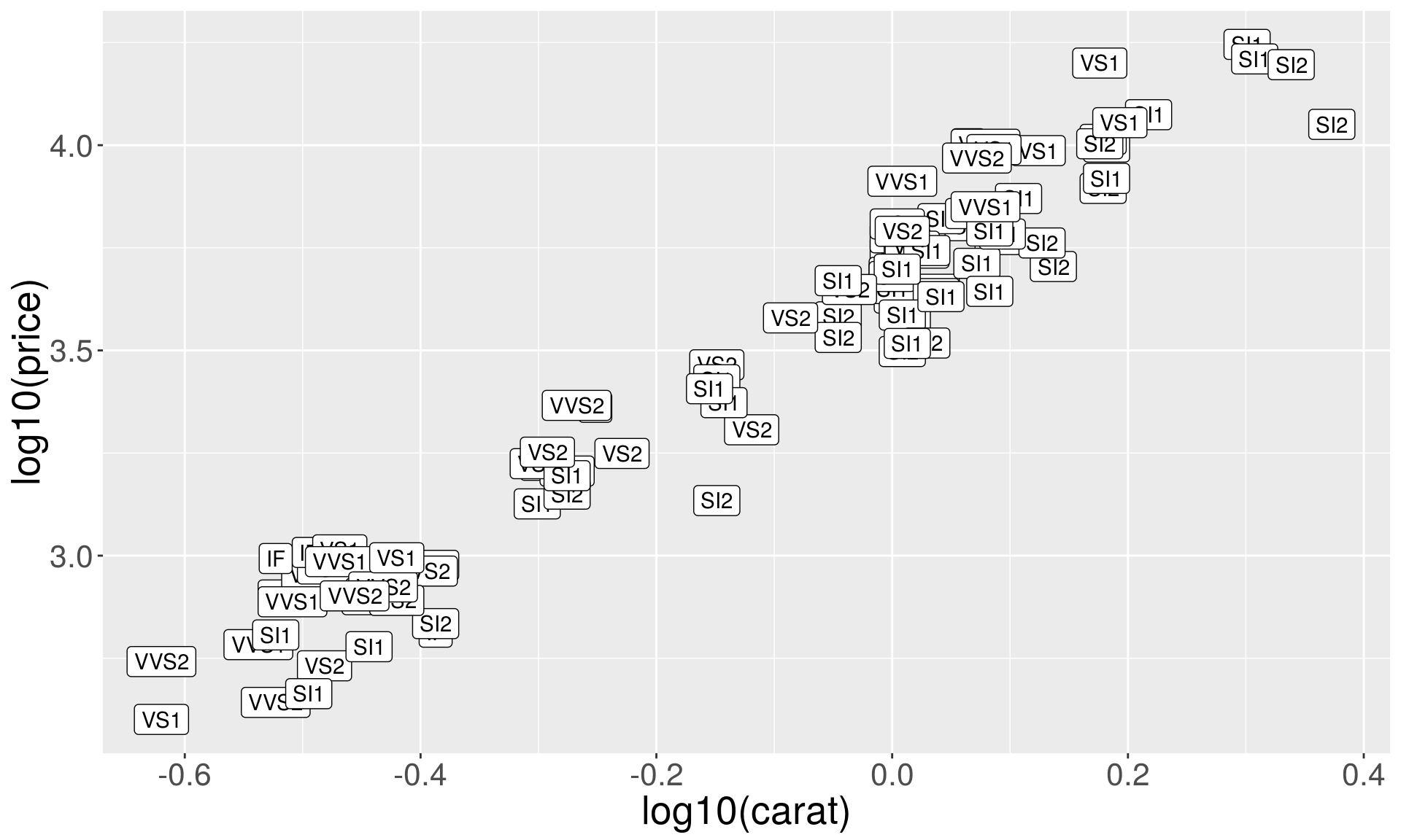
ggrepel package for annotation
ggrepel helps annotating overlapping labels.
# Uncomment the line below if you don't have 'ggrepel'
# install.packages("ggrepel")
library(ggrepel)
plog + geom_point() + geom_text_repel(aes(label = clarity), size = 3)
The shape of the points
# We first generate a subset of 'diamnonds' dataset
dsmall <- sample_n(diamonds, 500)
p1 <- ggplot(dsmall, aes(x = carat, y = price))

# set shape by diamond cut
p1 + geom_point(aes(shape = cut))
## Warning: Using shapes for an ordinal variable is not advised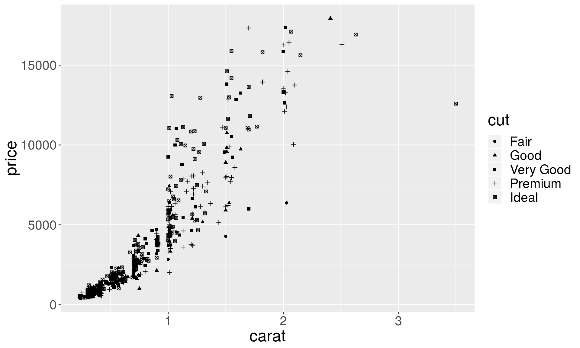
All 25 shape configurations
ggplot(data.frame(x = 1:5 , y = 1:25, z = 1:25), aes(x = x, y = y)) +
  geom_point(aes(shape = z), size = 5, colour = "darkgreen", fill = "orange") +
  scale_shape_identity()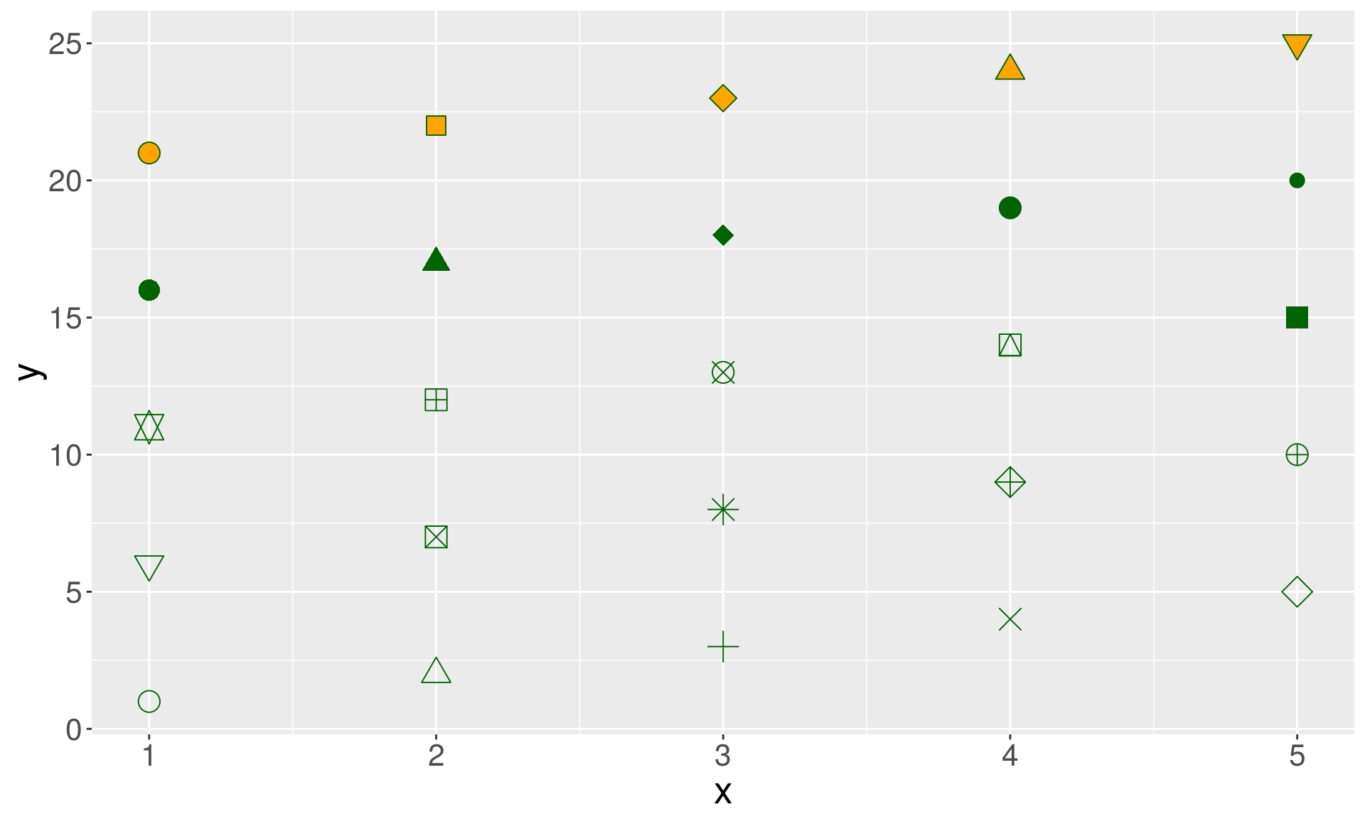
The color of the points
# color by diamonds color
p1 + geom_point(aes(color = color))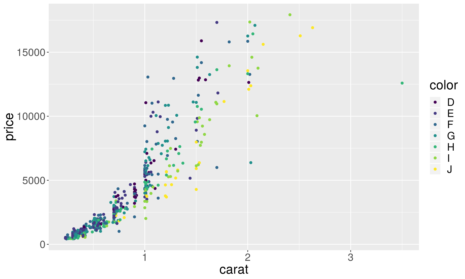
Set color and shape
p1 + geom_point(aes(shape = cut, color = color))## Warning: Using shapes for an ordinal variable is not advised
Variable vs fixed aesthetics
p1 + geom_point(aes(color = color))
p1 + geom_point(color = "darkgreen") 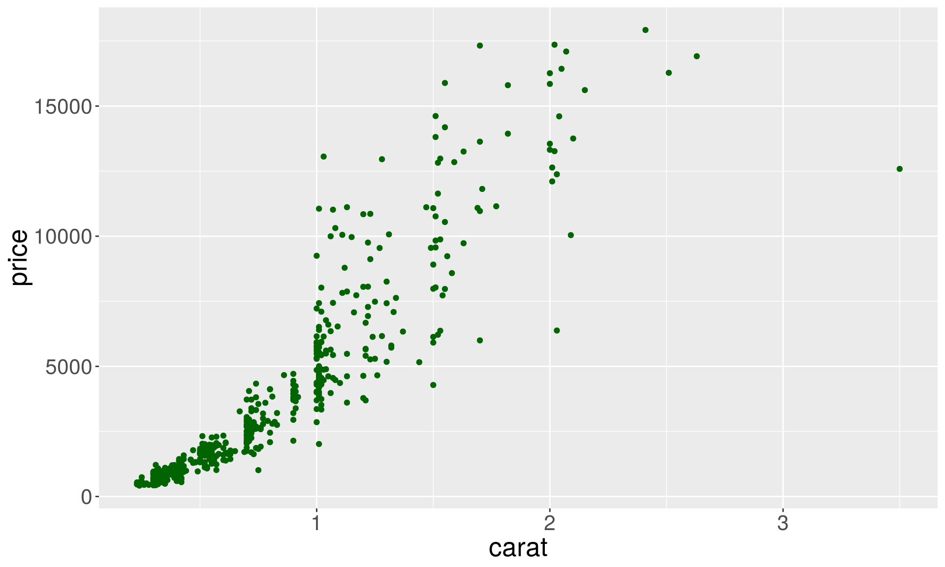
Marker points with borders
p1 + geom_point(aes(fill = cut), size = 3, color = "black", shape = 25)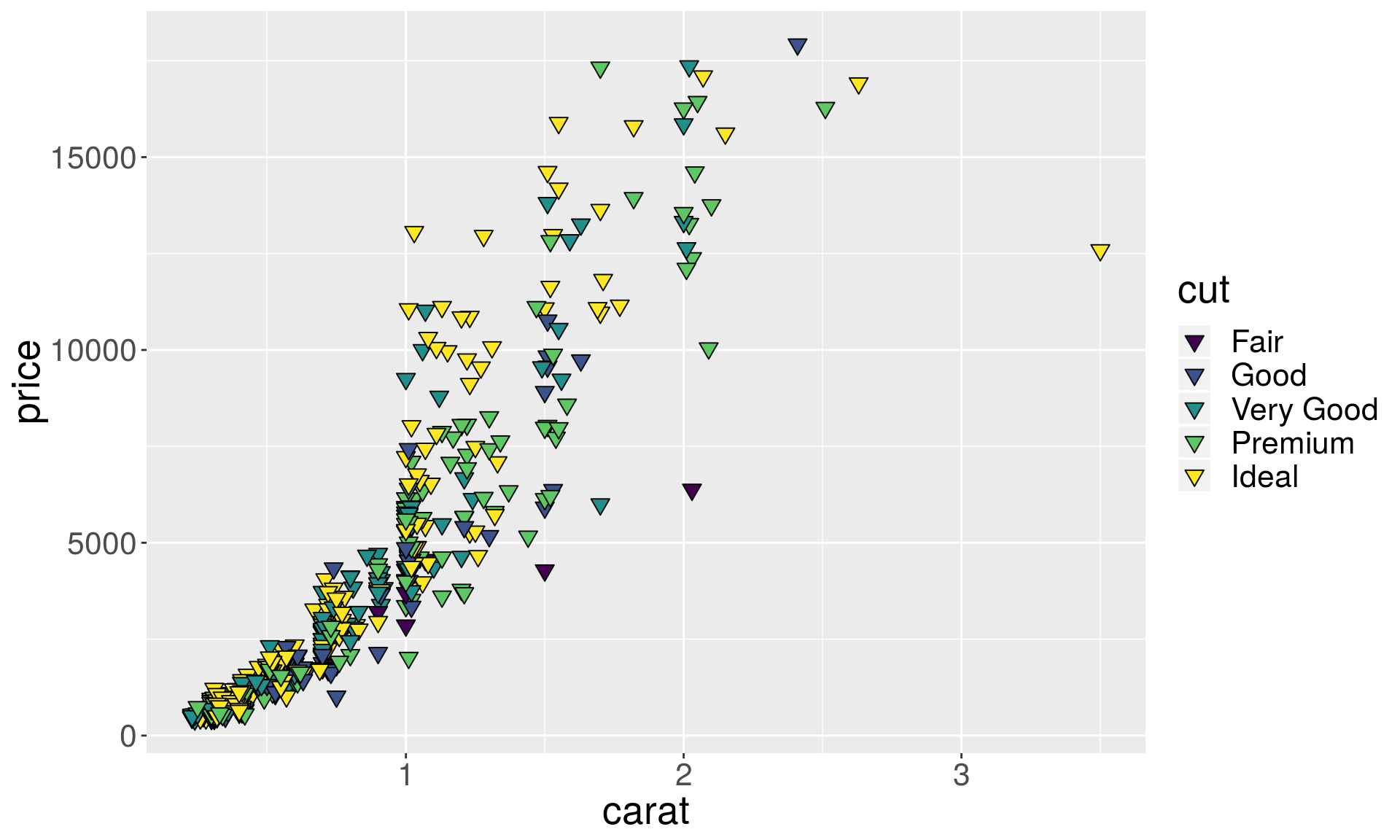
Alpha parameter for transparency
a1 <- p + geom_point(alpha = 1/5)
a2 <- p + geom_point(alpha = 1/50)
a3 <- p + geom_point(alpha = 1/500)

# We use grid.arrange from gridExtra to display multiple plots
library(gridExtra)
grid.arrange(a1, a2, a3, ncol = 3)
Scales for the axes
# Square root y-axis transformation
p1 <- ggplot(dsmall, aes(x = carat, y = price))
psqrt <- p1 + geom_point() + scale_y_sqrt()
# Log base 10 y-axis transformation
plog10 <- p1 + geom_point() + scale_y_log10()
grid.arrange(psqrt, plog10, ncol = 2)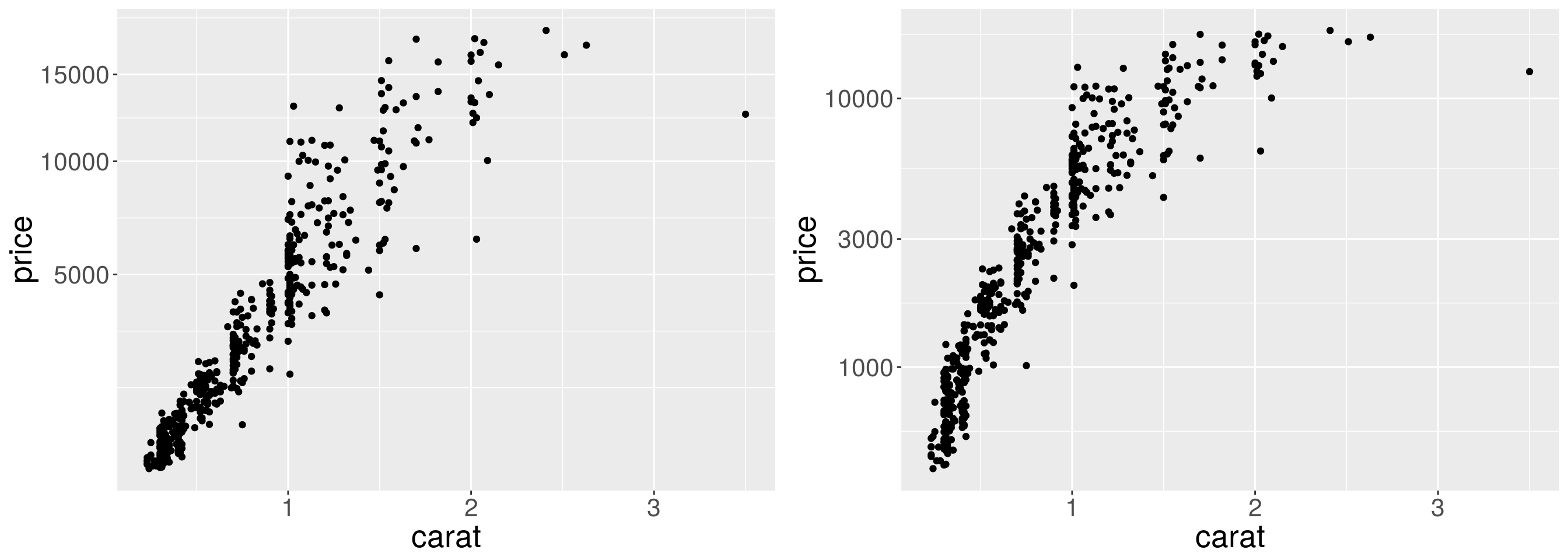
Log base 10 transformation of x and y axes. Note the differences.
ploglog1 <- p1 + geom_point() + scale_y_log10() + scale_x_log10()
ploglog2 <- ggplot(dsmall, aes(x = log(carat), y = log(price))) + geom_point()
grid.arrange(ploglog1, ploglog2, ncol = 2)
Scales for shapes
p11 <- p1 + geom_point(aes(shape = cut), size = 3)
p12 <- p1 + geom_point(aes(shape = cut), size = 3) +
  scale_shape_manual(values = c(1:5))
grid.arrange(p11, p12, ncol = 2)
## Warning: Using shapes for an ordinal variable is not advised
Scales for colors
To choose specific colors for discrete variables we use scale_color_manual.
p1 + geom_point(aes(color = cut), size = 3) +
  scale_color_manual(values = c("red", "orange", "yellow", "green", "blue"))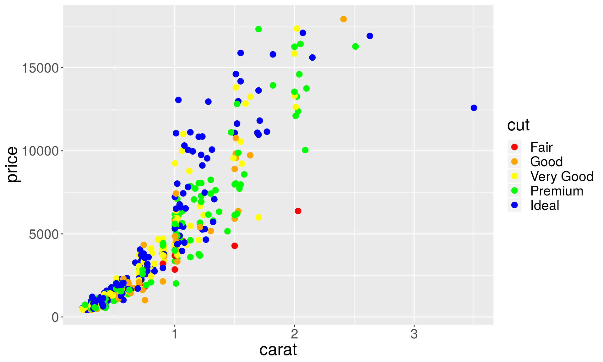
For continuous variables we use scale_color_gradient, and specify the ends of the color spectrum.
p1 + geom_point(aes(color = price), size = 3) +
  scale_color_gradient(low = "blue", high = "red")
You can also scale the values of the variable corresponding to color.
p1 + geom_point(aes(color = price), size = 3) +
  scale_color_gradient(low = "blue", high = "red", trans = "log10")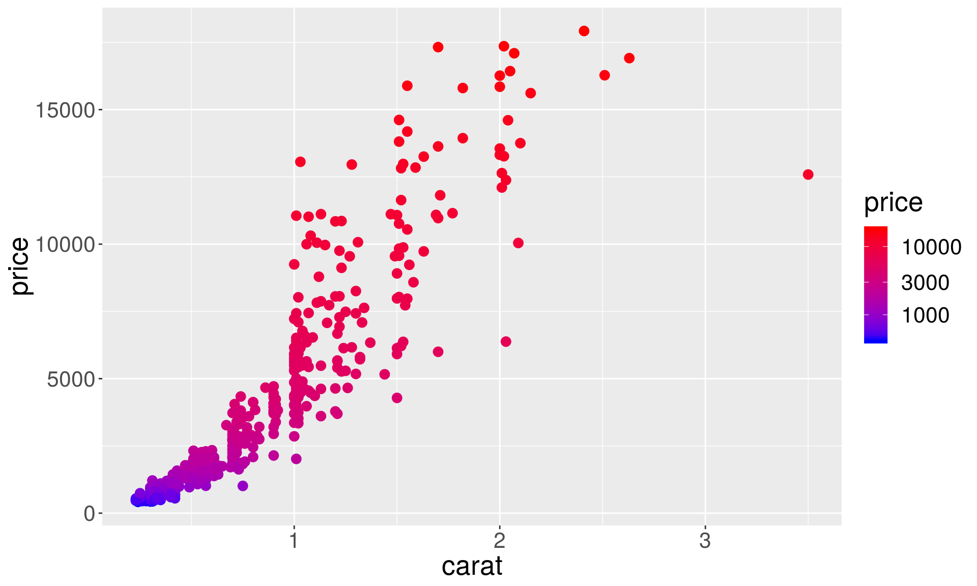
Or and add your own breaks
p1 + geom_point(aes(color = price), size = 3) +
  scale_color_gradient(low = "blue", high = "red", trans = "log10",
                       breaks = c(1000, 2000, 5000, 10000),
labels = c(" 1000", " 2000", " 5000", "10000")) 
scale_color_brewer lets you choose nice color palettes for discrete variables.
p1 + geom_point(aes(color = cut), size = 3) +
  scale_color_brewer(palette = "Set2")
Unfortunately, scale_color_brewer doesn’t work for continuous variables:
# This will result in an error
p1 + geom_point(aes(shape = price), size = 3) +
  scale_color_brewer(palette = "Spectral")
## Error: A continuous variable can not be mapped to shape
We can get around this issue using the RColorBrewer package and scale_color_gradientn function, which interpolates colors from the brewer palettes.
# install.packages("RColorBrewer")
library(RColorBrewer)
p1 + geom_point(aes(color = price), size = 3) +
  scale_color_gradientn(colours = brewer.pal(name = "Spectral", n = 10))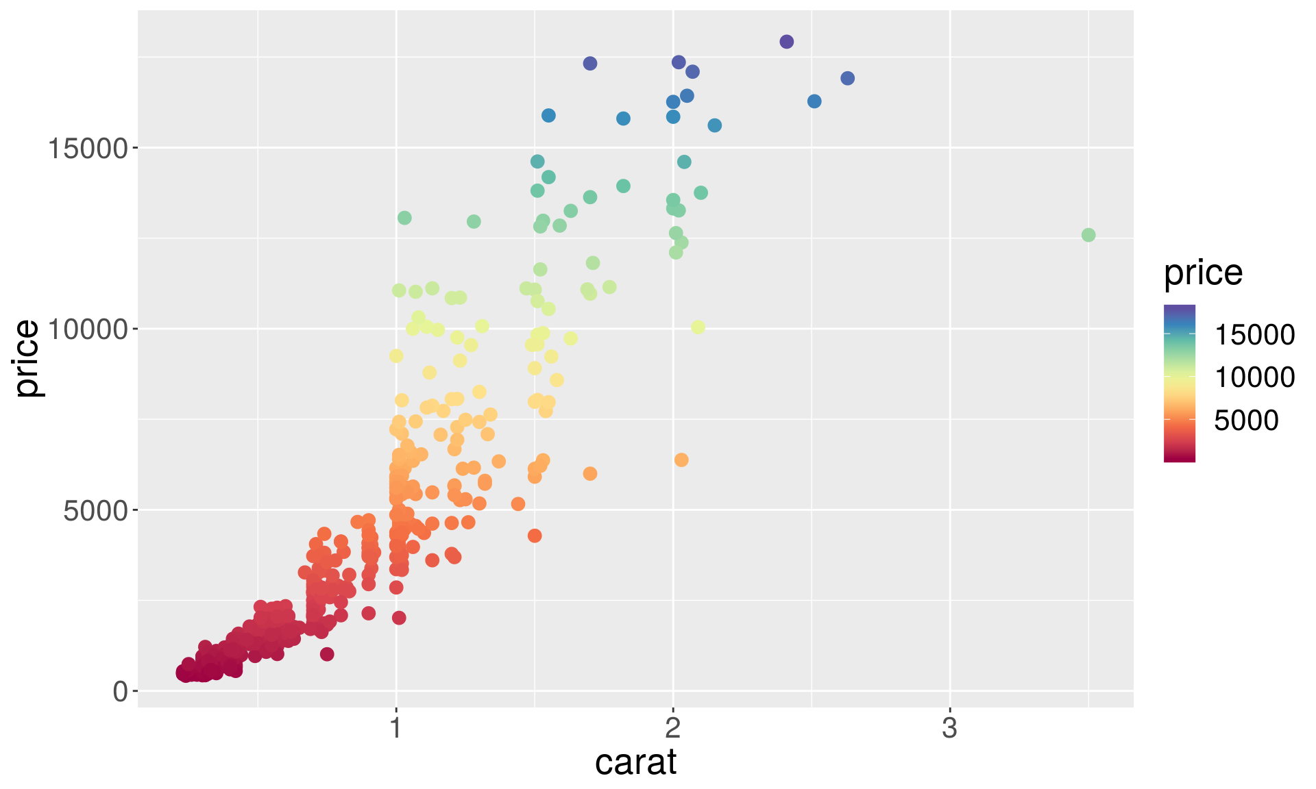
Another popular color scheme package, viridis, supports both discrete and continuous variables:
# install.packages("viridis")
library(viridis)
p1 + geom_point(aes(color = price), size = 3) + scale_color_viridis()
p1 + geom_point(aes(color = cut), size = 3) +
  scale_color_viridis(discrete = TRUE, option = "magma")
Wes Anderson color palette:
# For discrete variables
p1 + geom_point(aes(color = cut), size = 3) +
  scale_color_manual(values = wes_palette("Darjeeling1", n = 5))
# For continuous variables:
p1 + geom_point(aes(color = price), size = 3) +
  scale_color_gradientn(colours = wes_palette("Darjeeling1", 100, type = "continuous"))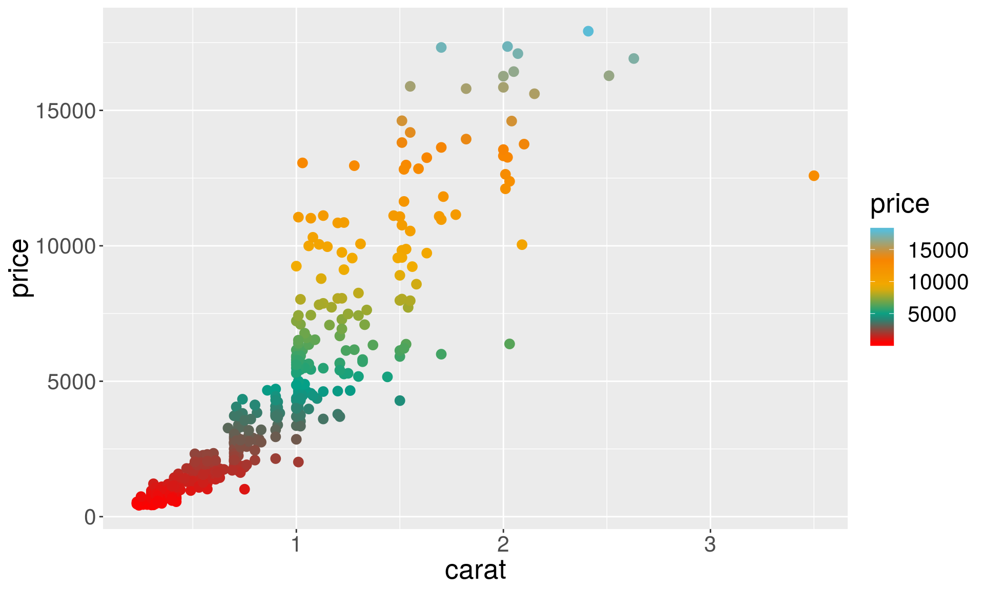
Facettng allows you to split up your data by one or more variables and plot the subsets of data together.
dsmall <- diamonds[sample(nrow(diamonds), 1000), ]
p0 <- ggplot(data = dsmall, aes(x = carat, y = price)) +geom_point(size = 1) +
  geom_smooth(aes(colour = cut, fill = cut))
p1 <- p0 + facet_wrap(~ cut)
grid.arrange(p0, p1, ncol = 2)
ggplot(diamonds, aes(x = carat)) +
  geom_density() +
  facet_grid(color ~ cut)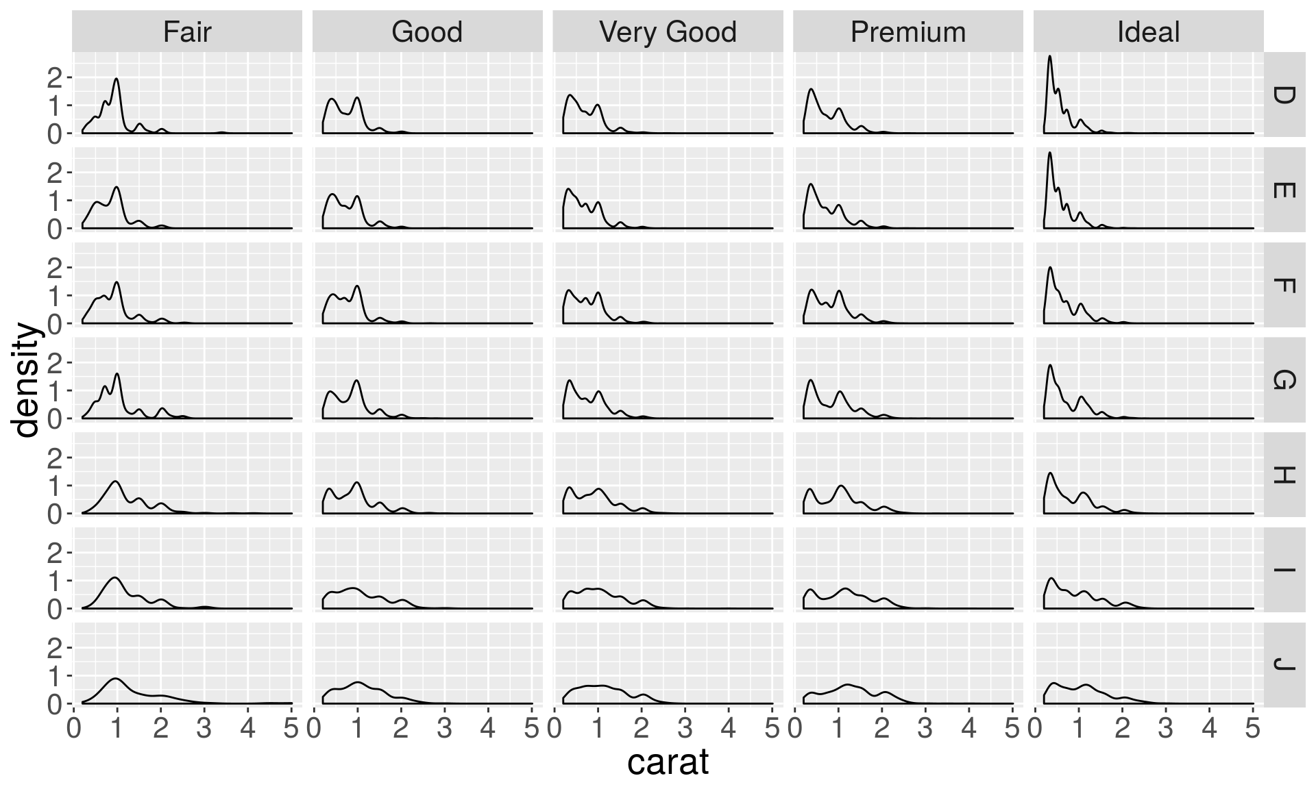
Box plot transformation
Plotting a summary (less data) can be more insightful.
ggplot(data = diamonds, aes(x = cut, y =carat)) +
  geom_boxplot()
Histogram and density plots
# Distribution of the carats (weights) of the diamonds.
h <- ggplot(data = diamonds, aes(x = carat)) + geom_histogram()
d <- ggplot(data = diamonds, aes(x = carat)) + geom_density()
grid.arrange(h, d, ncol = 2)
## `stat_bin()` using `bins = 30`. Pick better value with `binwidth`.
Histogram parameters
In histograms, the smoothness is controlled with bins and binwidth arguments. (or by specifying using the breaks explicitly).
p <- ggplot(data = diamonds, aes(x = carat)) + xlim(0, 3)
h1 <- p + geom_histogram(binwidth = 0.5)
h2 <- p + geom_histogram(binwidth = 0.1)
h3 <- p + geom_histogram(binwidth = 0.05)
grid.arrange(h1, h2, h3, ncol = 3)
Density plot parameters
In density plots, the bw (the smoothing bandwidth) and adjust arguments control the smoothness.
d1 <- p + geom_density(adjust = 5)
d2 <- p + geom_density(adjust = 1)
d3 <- p + geom_density(adjust = 1/5)
grid.arrange(d1, d2, d3, ncol = 3)
Histograms for separate groups
# Here we show grouping by diamonds cut.
h <- p + geom_histogram(aes(fill = cut), position = "dodge", bins = 10)
d <- p + geom_density(aes(color = cut))
grid.arrange(h, d, ncol = 2)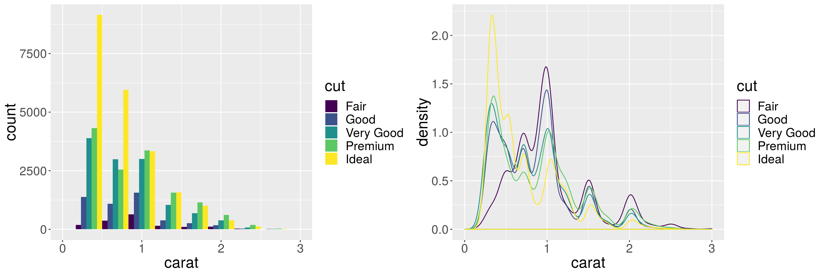
Instead of marginal distributions, we can plot distribution of components stacked on top of each other to see the contribution from each of group.
h <- p + geom_histogram(aes(fill = cut), position = "stack")
d <- p + geom_density(aes(fill = cut), position = "stack")
grid.arrange(h, d, ncol = 2)
## `stat_bin()` using `bins = 30`. Pick better value with `binwidth`.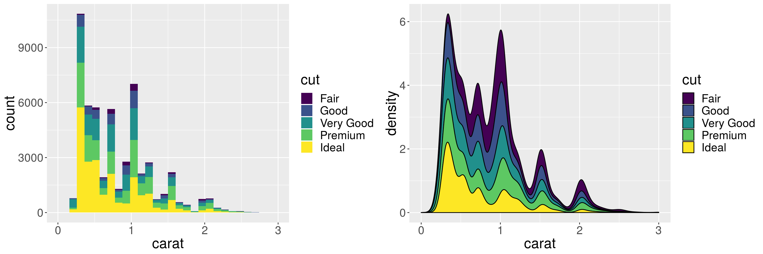
Position adjustments for scatterplots
Overplotting: many points overlap each other. Here variables are categorical, but sometimes rounding causes overplotting.
plt <- ggplot(diamonds, aes(x = cut, y = depth))
plt + geom_point()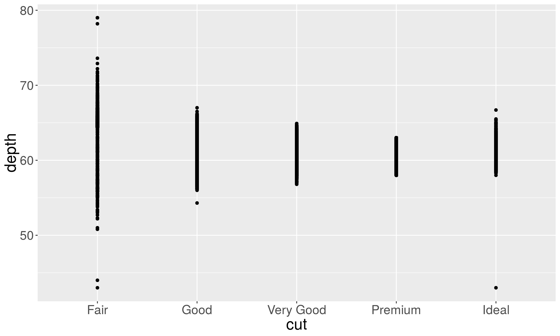
plt + geom_point(position = "jitter")
b1 <- ggplot(diamonds, aes(x = clarity)) + geom_bar()
b2 <- ggplot(diamonds, aes(x = clarity)) + geom_bar(aes(weight = carat)) + ylab("carat")
grid.arrange(b1, b2, ncol = 2)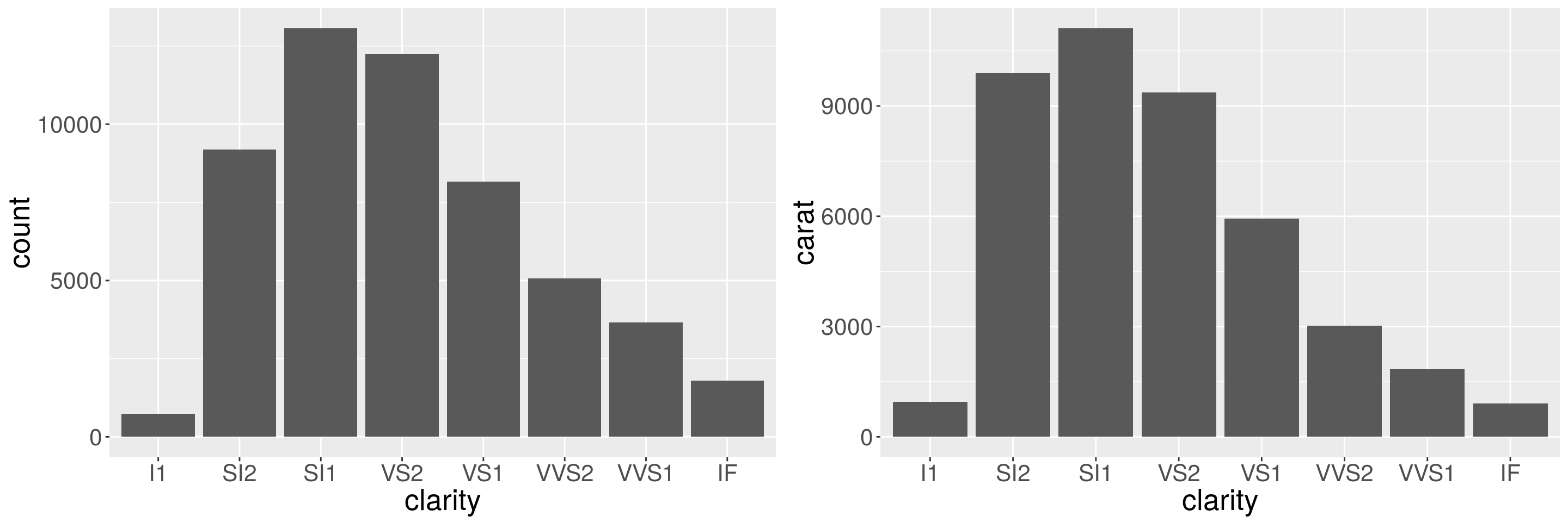
The left plot shows the number of diamonds in each clarity group, and the right plot shows the count weighted by carat, which is equivalent to showing the total weight of diamonds in clarity color group.
With the frequency counts already computed, the default options of the barplot generates an error:
diamond.counts## # A tibble: 7 x 2
## color count
## <ord> <int>
## 1 D 6775
## 2 E 9797
## 3 F 9542
## 4 G 11292
## 5 H 8304
## 6 I 5422
## 7 J 2808ggplot(diamond.counts, aes(x=color, y=count)) + geom_bar()## Error: stat_count() must not be used with a y aesthetic.
# You need to do the following:
ggplot(diamond.counts, aes(x=color, y=count)) +  geom_bar(stat="identity")
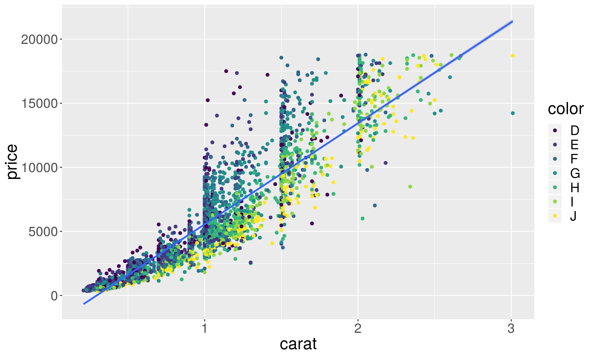
Smoothers and trend lines
# Smoothers help discern patterns in the data
set.seed(438756)
dsmall <- diamonds %>% sample_frac(0.1)
ggplot(dsmall, aes(x = carat, y = price)) +
    geom_point(aes(color = color)) + geom_smooth()
## `geom_smooth()` using method = 'gam' and formula 'y ~ s(x, bs = "cs")'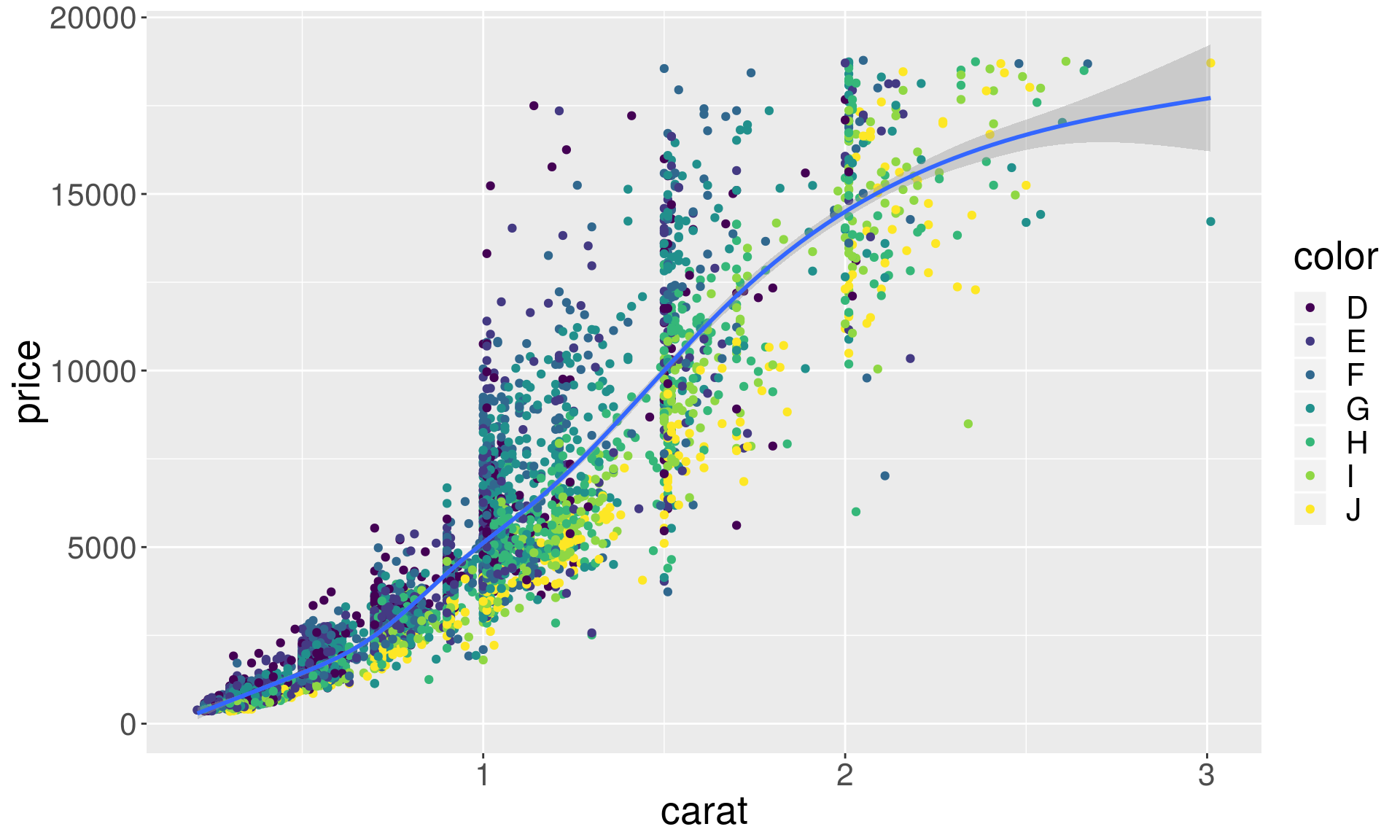
Regression lines with ggplot2
ggplot(dsmall, aes(x = carat, y = price)) +
    geom_point(aes(color = color)) + geom_smooth(method = "lm")